How To Create A Product That Sells Part Four
This is the fourth and final installment in creating and making money from your own information product.
Previous articles can be found here:
- How To Create A Product That Sells
- 3 Ways To Make $100,000 Online Selling Your Own Product
- 3 Mistakes That Kill Product Sales (Even Before You Start Selling!)
This article will focus on an aspect of marketing and selling that is not overlooked, but is poorly executed: Your Web Design or Theme.
I will tackle one of the most common myths that overwhelms people regarding exactly how many pages you need on your website to sell a product (hint: it’s a lot fewer than you think).
Is Your Web Design Important To Selling?
Very emphatically YES!
This research showed that poor web design can trigger “mistrust” in visitors. Nothing to do with your content or even the quality of information you have, but the actual look of your website.
The research was conducted by Elizabeth Sillence and her team. They reviewed feedback from people regarding websites about hypertension.
She asked people to record whether they trusted or distrusted a website and why.
A whopping 94% cited design problems for the reasons they distrusted a website.
What Is The Goal Of Your Website?
If you get the purpose of your website clear, then all your design worries and cluttered layouts should be erased.
Think of your sales funnel – and the website is the start of that funnel where you turn visitor into customer.
Let’s be honest. The goal of most websites is to make money. So you either want to sell your product/service or get people to sign up to your email list so you can build a relationship with them.
If those are your two main goals, why are there 20 other things in your sidebar?
A good starting point is this article and video from this blog archives – Can Your Blog Explain Its Purpose In One Second?. Once you have read and watched that, read on…
More Choices = Less Action
Savvy marketers will know the famous jam study. The study presented shoppers with a small selection of jams versus a larger selection. Here is a recap of the study and results:
Here’s the interesting part. Sixty percent of customers were drawn to the large assortment, while only 40% stopped by the small one. But 30% of the people who had sampled from the small assortment decided to buy jam, while only 3% of those confronted with the two dozen jams purchased a jar.
That study “raised the hypothesis that the presence of choice might be appealing as a theory,” Professor Iyengar said last year, “but in reality, people might find more and more choice to actually be debilitating.”
Read more here about the jam study here.
If Your Website Sells Stuff This Is How Your Layout Should Be
Keep your sidebar simple.
- Opt-in form at the top.
- Some key content pages or Pillar Articles.
- And then your most popular posts.
Simple, clean and uncluttered. Increasing the chance of someone entering your sales funnel and actually buying something.
7 Pages You Need To Make Money
Lots of people get overwhelmed when it comes to thinking about setting up a website to sell stuff. So we are going to clarify the essential pages you need to sell stuff online.
No magic here. You will see these same pages used in all the guru product launches. Let’s begin.
1. Feeder Page(s)
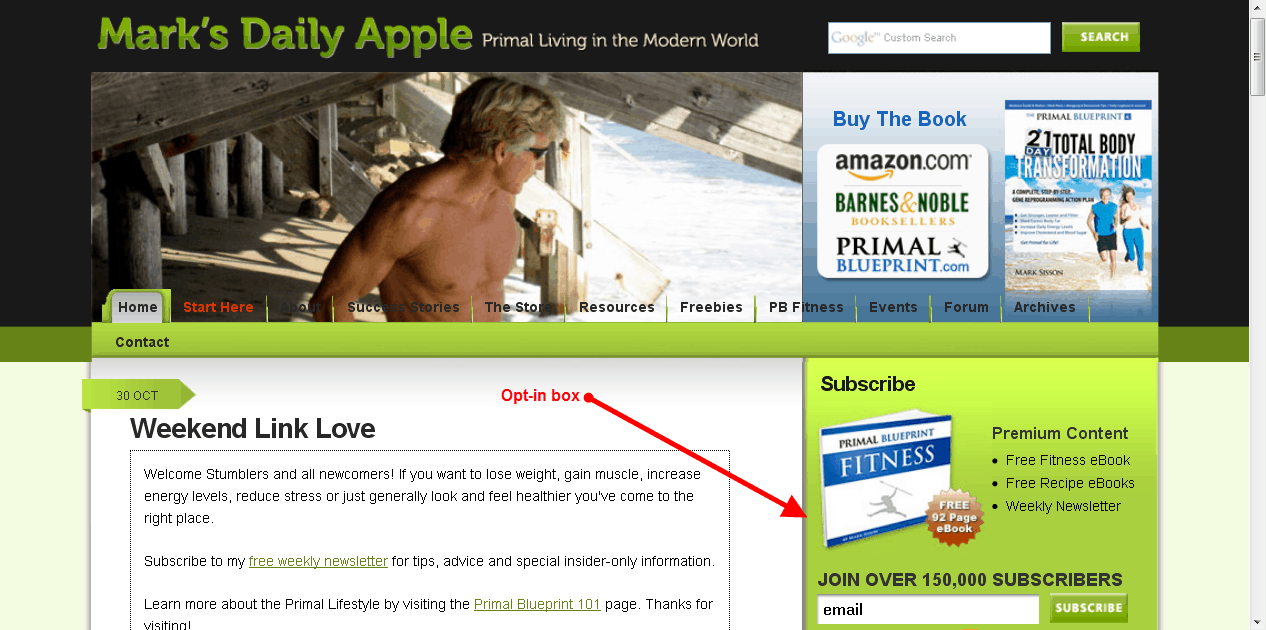
This is the start of your sales funnel. The page that gets traffic to your website. If you are doing SEO this can be more than one page – it can be every content page on your blog. It could even be a Twitter or Facebook page. Usually this will be the homepage of a blog.
The homepage of my blog is a good example of this.
2. Opt-In Page
As previously mentioned this doesn’t even have to be separate page. It can be in the sidebar or at the end of posts, or in a pop-up or header box. Usually you will use some “opt-in bait” to get people to sign up.

3. Value Page(s)
This is where you deliver your “opt-in bait” to people who have signed up. There can be a few of these pages like in a product launch and they can deliver video, audio or a written report as the incentive.
4. Sales
Your sales page. This will have your killer copy written on it. See my copywriting series for help in this area.
5. Checkout
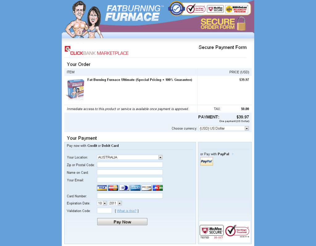
Some sort of checkout page. If you are using PayPal or Clickbank this may not even be on your website.
Below you can see a Clickbank checkout page. At this stage in the transaction, the last thing you want is the customer to abandon the sales process because of a dodgy looking checkout page.
With Clickbank you get a professional looking page with a customizable header, virtual picture of the product and security with all the professional looking symbols (top right). All this adds up to reassurance for the buyer that their purchase is safe and the product they are buying is legitimate.
6. Upsell or Downsell Page
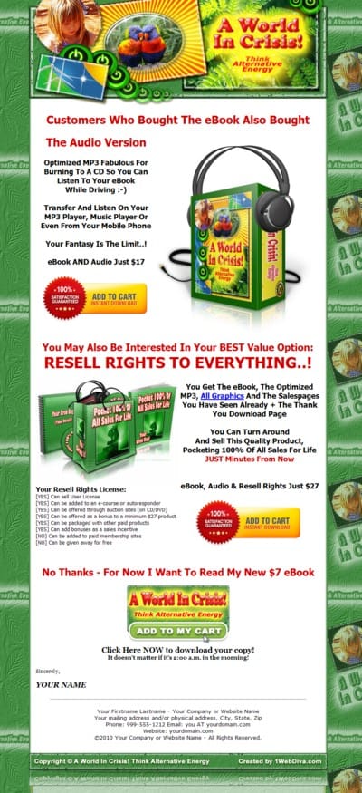
An opportunity to make more money with a simple page offering complimentary items.

7. Thank You
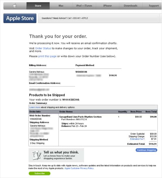
And this is self-explanatory. After the purchase thank people for their purchase. And also reiterate what they should expect next related to receiving their product e.g. “It will be delivered shortly to your email” or “You will receive it in the mail in 7-10 days”.

Conclusion
Hopefully when you see it broken down like this you realize that having a money making website is not that hard to set up. What I have shown you is simplified but that is really all you need and that is how many of the multi-million dollar products are sold online.
Yaro


Nice comprehensive post Leevi – as I often see, it is not the technical process rather the procrastination in execution which leaves many behind. Not many things are hard to do online today given the tools we have at our disposal
Awesome information! One thing I thought I might add. If you have a mailing list, the best thing you can do is to take the time to personally email them when they have questions. I’ll even email them asking if they have any questions or issues. Then, I will respond to them and help them to the best of my ability.
What I find, is that they trust me more, and they are willing to learn from me.
hi Leevi-
good tips on keeping it simple. bad design can create mistrust, I also believe over-design (too much animation, pop-ups, blinking ads) can seem scammy, un-professional, pushy.
great stuff Leevi… i’m getting ready to launch a product.. Just what I needed..
Question… correct me if I’m wrong.. Upsell is when you sell something while they are in the buying mood.
downsell is when they are leaving and you offer them a cheaper product
Did I get. Thanks in advance
Hi Dennis,
You got it!
You are absolutely right about keeping the site uncluttered and giving only a few options to visitors. In fact, giving them a single option is even better. But before they take the action of signing up or buying the product, they would certainly want to know the credibility and expertise of the person selling them. So, highlighting the best content on the first page might be of a great help (Most popular, Most commented, Most visited articles, etc)
I like the tips about keeping it simple. I used to have loads of banners in the sidebar, but after I realised that basically no one ever clicks on them I decided to remove them and focus entirely on the opt ins and writing great content.
The worst thing that you can do is fill your sidebar with Affiliate banners and Adsense Ads. You usually only earn peanuts from them anyway, and they just put people off.
By keeping it simple and getting rid of the junk you are far more likely to get opt-ins.
Hi Scott,
Many people will discover the “hard way” what you have just revealed.
Think about the priorities of your website and remove the bumps in your sales funnel.
Leevi
Hi Leevi,
I am truly learning and enjoying your series on products and selling. I have learned much so far.
This post is making me want to clean up my site a little more.
Cheers Justin!
Glad you’re enjoying it.
Leevi
Great advice, I will try to follow it as much as possible. Thanks!
You make it seem so clean and simple. I get it when I read your article, but when I’m on my own it slips away and I get confused. I think I need to just let your advise soak in a while before I get my pages all jumbled. Thanks
Thanks for the info Leevi,
About such a ‘Thank You Page…..,’
Isn’t it almost Thangsgiving?
Reminds me to say that a long time ago I created a ‘Thank You for Buying’-Note for people that bought a tiny little ebook I wrote,
It’s a Note that an Autoresponder will Automatically send
to you when you buy it.
For what – Making Money – is concerned, I do think that a great way to Make Money is to Sell great Back End Sales Products, like for example things like Consultancy, Courses or things like Speaking on Stage.
On my – Writer’s Lifestyle – Blog, (on the ‘Events Page’) you can find some very interesting info about Speaking on Stage and there you can also find the tiny little (the Vision) eBook that I was talking about at the start of this reply (you can even already see a few pages, of it) So feel free to have a look, even when you don’t buy my tiny little ebook
‘- Thanks – for visiting my Blog :)’
Hey Leevi
Nice summary of some very critical information. Is putting an optin right into a header a fairly simple programming task or is it somewhat complicated? I’d love to have my opt-in in my header?
Cheers
Mark
Many people get caught up in doing SEO practices that they forget the most important aspect of selling something on the web. As a blogger, my main focus is to create interesting and informative content, which in turn helps my SEO and readership development. I try to keep everything as simple as possible. I try to keep my design clean and neat, something not too up front to my visitors. To me, simple is always better because you never want to make it seem as if you are trying TOO hard.
It looks so much more straight forward when you see it all written down in steps in front of you. What pages to have on your website and which should take priority can seem very confuusing and hit and miss.
The classic is the websites that are promoting product after product with very little useful infromation and no real user value. But if you go too far to the other extreme, offering nearly all free content, then it is very difficult to find buyers when your readers are used to getting everything for free.
Interface is everything. A trusted credible interface.
Hire a Usability and Instructional Design expert. Someone that understands the psychology behing interface design.
Keep it simple, clean and usable (deliver a great product). That’s my motto.
Hi Leevi! I just wanted to say thank you, for four great articles. I’ve written all keypoints down in my own language (Norwegian), and It’s given me a new kick to start making niche sites that actually sell. My biggest issue has been the actuall niche…how to find an audience, to do research. I guess what everyone has been having trouble with, is finding a niche that you feel compelled writing about…from now on, I’ll put your tips into action! – Peter-
I integrated an aStore on my niche site a while back too. It was easy, painless and I have no regrets whats-so-ever. If your Niche allows for larger ticket items, this can easily offset any concern about the lower % commission rates paid by amazon. It’s just a numbers game like any other opportunity.